


Progress on other projects.
Right now, I'm working on the frame to finished the 2nd project. That should be completely finished by next week.
For my 4th and final project, I think I want to do a "branding" project. My mother is part of the Bremen Bible Class Association, a program at Bremen Public Schools that takes the kids from school for 45 minutes to a local church for a short Bible lesson. As of right now, they do not have a logo. I think it would be neat to do that for them since I went through that program when I was in elementary school. Here is what I'm thinking I'll be designing for the BBCA.
-Logo
-Business Card
-Letterhead
-Brochure
-Mailers
-Return Address Label
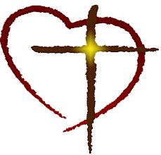
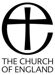
Inspiration.


Colors.
I'm going to stick with the colors of Dark Green, Grey and White. In Christianity, colors have their own meanings. I have researched the colors and felt that Green and White would be the best choices.
Green -- symbolizes growth. Mainly pertains to plant life, but it can also means growth within a person. These children are coming to the class to learn and grow in their relationship with Christ, so I thought that this was a fitting color.
White -- symbolizes purity, innocence, and holiness.
Grey -- symbolizes humility, which is something that every human should strive for.

(The black would be used very minimally -- probably for some text)

Something I just whipped up really quickly.
Professional Documents.
Here is the color scheme that I am planning on using for all of my professional documents (business card, website, and resume)

No comments:
Post a Comment